
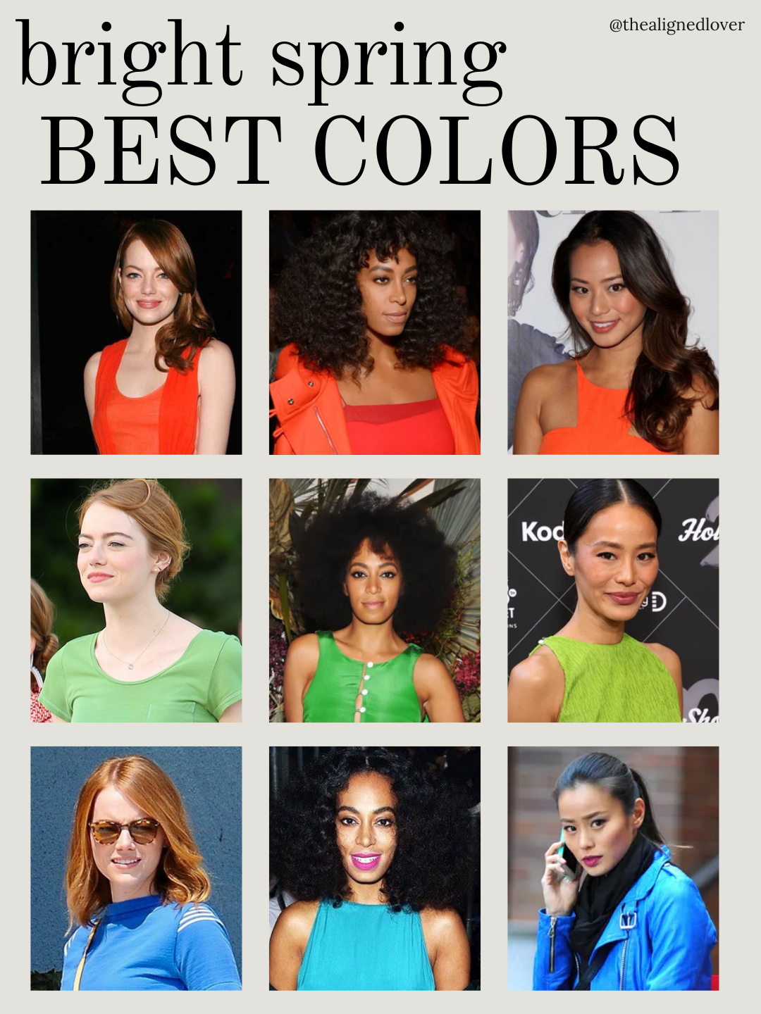
Bright Spring is one of the most radiant palettes in seasonal color analysis. Defined by neutral-warm undertones, high chroma, and sparkling clarity, it thrives on colors that are lively, fresh, and luminous. The right shades bring warmth and brightness to your skin and sharpen your natural contrast, while muted, earthy, or overly dark tones flatten your energy.
To understand how this works, let’s explore the oranges, greens, and blues that define the Bright Spring color palette, with examples from three Bright Spring celebrities: Emma Stone, Solange, and Jamie Chung. These examples show which shades highlight their radiance and which diminish it.
Bright Spring Color Palette: Oranges
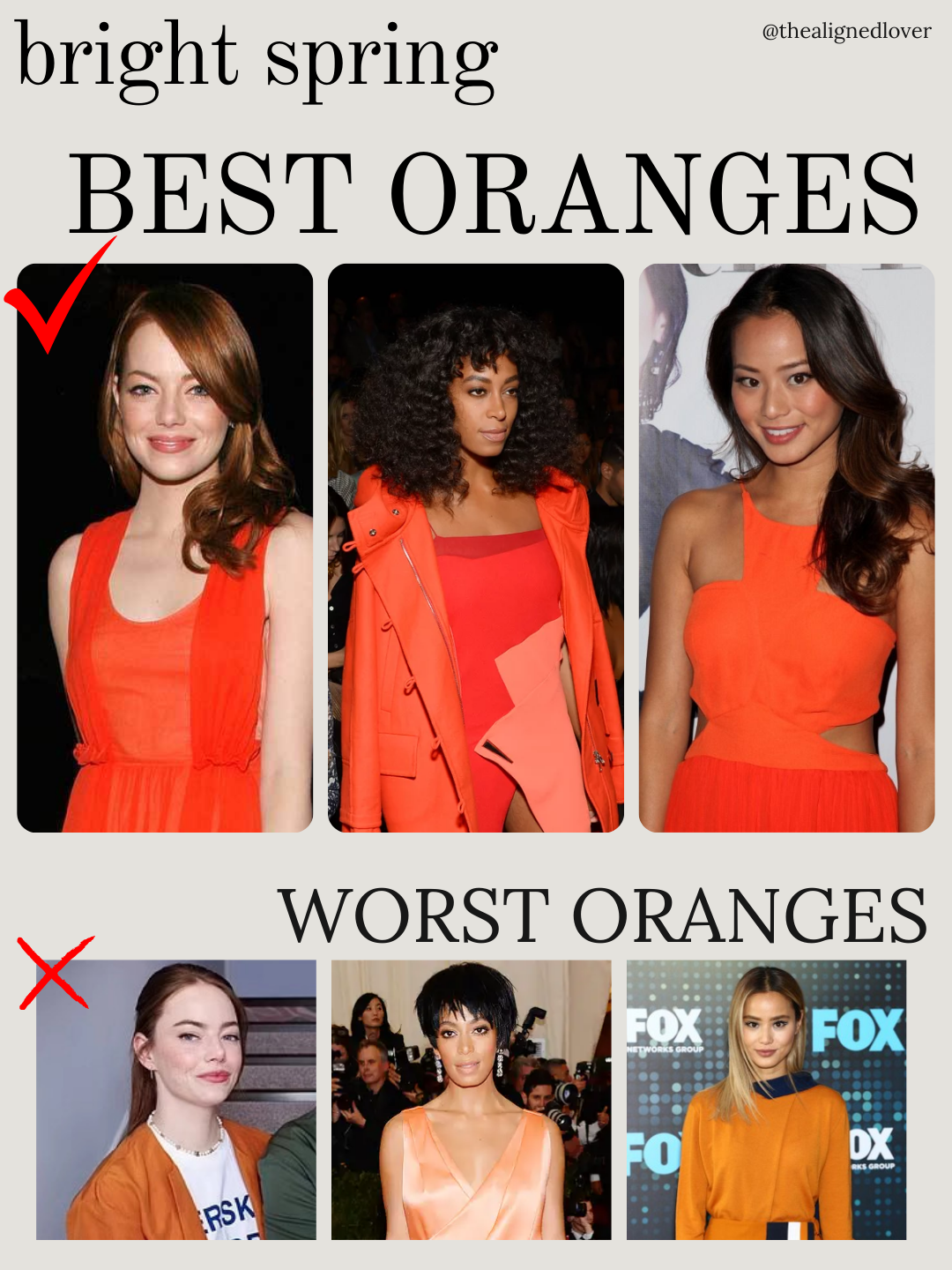
Emma Stone, Solange, and Jamie Chung wearing tangerine and clear orange shades demonstrate Bright Spring oranges.
Winning shades: tangerine, bright coral-orange, vivid clear orange
Shades to avoid: rust, powdery peach, autumnal orange
- Emma glows in tangerine, while rust orange dampens her energy.
- Solange radiates in bright orange, but powdery peach mutes her natural glow.
- Jamie sparkles in coral-orange, yet autumnal tones feel heavy.
Why it works: Bright Spring oranges are juicy, lively, and sunlit. Rust or brown-based shades reduce contrast and flatten the vibrant clarity of the palette.
Bright Spring Color Palette: Greens
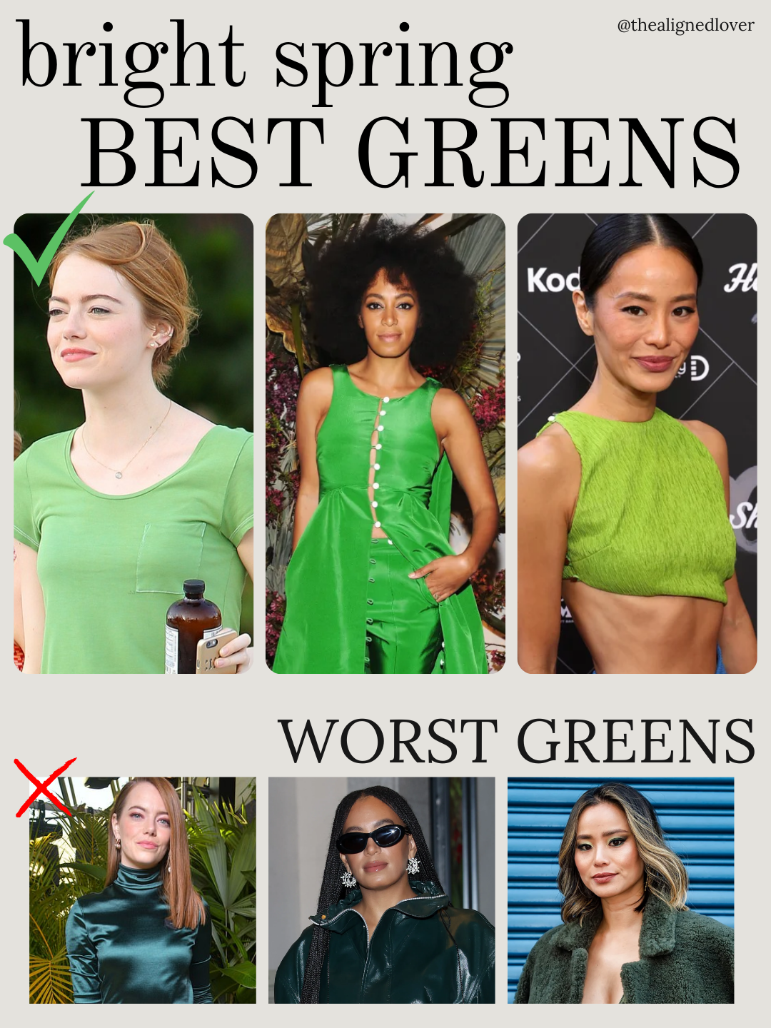
Bright Spring greens are fresh, clear, and light-reflecting.
Winning shades: spring green, vivid grass green, warm lime
Shades to avoid: dark teal, deep pine, forest green
- Emma shines in spring green; dark teal overwhelms her features.
- Solange glows in vivid grass green, while very dark shades obscure her clarity.
- Jamie sparkles in lime green, yet pine tones flatten her brightness.
Why it works: Bright Spring greens are lively and luminous, amplifying contrast and natural radiance. Muted or earthy greens dull the palette’s vitality.
Bright Spring Color Palette: Blues
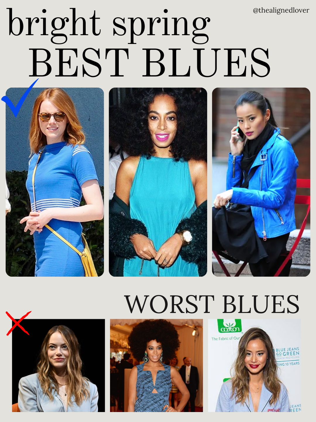
Bright Spring blues lean toward aqua and turquoise, vibrant and clear rather than muted or deep.
Winning shades: turquoise, lively aqua, clear bright blue
Shades to avoid: muted pastel blue, navy-black, faded chambray
- Emma glows in mid-tone spring blue, while muted pastel blue softens her presence.
- Solange dazzles in turquoise, but navy-black patterns feel heavy.
- Jamie sparkles in bright blue, yet chambray diminishes her clarity.
Why it works: Bright Spring blues are crisp and playful, enhancing contrast and energy. Muted or dark blues flatten the look.
Bright Spring Color Notes
| Color Family | Winning Shades | Shades to Avoid | Key Notes |
|---|---|---|---|
| Oranges | Tangerine, coral-orange, bright clear orange | Rust, powdery peach, autumnal orange | Fresh, juicy, sunlit |
| Greens | Spring green, vivid grass green, lime | Dark teal, pine, forest | Lively, luminous, clear |
| Blues | Turquoise, aqua, bright blue | Muted pastel, navy-black, chambray | Playful, sparkling, high-contrast |
How to Know If You’re a Bright Spring
You may be a Bright Spring if:
- Juicy oranges, vivid greens, and lively blues make your skin glow and features pop
- Muted, earthy, or dark shades make you look washed out
- You thrive in high-contrast, warm-leaning combinations, like coral paired with aqua or lime green with ivory
Key traits of the Bright Spring palette:
- High chroma: pure, saturated colors that feel luminous
- Neutral-warm undertones: fresh warmth without earthiness or gold-heavy tones
- Contrast: bright, clear pairings that energize the look
Frequently Asked Questions
What is the Bright Spring palette?
Bright Spring is a high-chroma, neutral-warm seasonal palette. It includes juicy oranges, coral, aqua, turquoise, lime, and bright yellow, balanced with light neutrals.
How do I know if I’m Bright Spring?
If fresh, lively shades make you glow while muted, earthy, or dusty shades feel heavy or dull, you may be Bright Spring. High-contrast, energetic combinations will feel natural.
Which colors should Bright Spring avoid?
Muted, earthy, or dark shades such as rust, olive, mustard, taupe, and muted pastels flatten brightness and reduce contrast.
Which celebrities are Bright Spring?
Emma Stone, Solange, and Jamie Chung illustrate Bright Spring. Their best colors are vivid and fresh; muted or dark shades soften their natural glow.
Bright Spring vs Bright Winter: What’s the difference?
Bright Winter is cool and icy, with jewel-like clarity. Bright Spring is neutral-warm, playful, and sunlit. Both are bright, but Spring leans lively and warm, Winter crisp and cool.
Explore Your Bright Spring Palette
- Discover your personal colors with my Color Palette Creation service
- Explore the full set of seasons and see where Bright Spring fits: Explore the 12 Color Seasons
- Dive deep into Bright Spring specifics: Guide to the Bright Spring Seasonal Color Palette
- Learn the full framework for navigating all palettes: Virtual Guide: Navigating the World of Seasonal Color
Embrace Bright Spring by embracing clarity, contrast, and vitality.
Happy exploring.
xx
Nona